

Top 7 Summer Home Décor Trends for Lifestyle Retail in 2026
- Annie Zhang

- 3 days ago
- 7 min read

A summer collection can feel flat even when every item looks attractive on its own. The color may be beautiful, but too seasonal. The shape may be interesting, but hard to place in a home. The material may look good in a sample room, but lose its warmth on a retail shelf.
That is why home décor trends are most useful when they are translated carefully. Instead of copying interiors directly, lifestyle retail can borrow their design language: softer forms, warmer palettes, tactile surfaces, compact scale, natural materials, and calmer display stories.
Houzz’s 2026 U.S. Emerging Summer Trends Report highlights several directions that are relevant for this kind of translation, including soft geometry, tactile textures, earthy colors, wellness styling, eco-conscious materials, compact outdoor areas, and European garden romanticism. Below are seven trends that may influence lifestyle retail in 2026, especially across smaller decorative objects, botanical accents, glass pieces, packaging, and seasonal home décor.
1. Soft Geometry Is Becoming More Natural in Home Accessories
Soft geometry is one of the clearest visual directions in the Houzz report. Searches for scalloped tile increased 210%, arched range hood increased 177%, arched pantry door increased 130%, and rounded kitchen island increased 123%.
These are interior design terms, but the visual language can move into smaller home categories. Arches, rounded corners, scalloped edges, domes, curved trays, circular frames, and wave-like details all soften a display without making it feel overly decorative.
For lifestyle retail, this does not mean every object needs to become round. The better takeaway is more practical: hard edges and strict minimalism are giving way to gentler outlines. A tabletop piece, a box, a glass cover, or a small decorative object can feel more current simply by having a softer silhouette.
Interior Signal | Lifestyle Retail Translation |
Arched doors | Arched frames, curved packaging windows |
Rounded islands | Circular trays, round boxes, soft-edged objects |
Scalloped tile | Scalloped paper edges, wave-like surface details |
Curved staircases | Flowing product displays and rounded forms |
For teams developing floral décor, glass objects, or compact decorative pieces, soft geometry is a useful design reference. For material or format ideas, Sweetie can share examples at sales@sweetie-group.com.
2. Tactile Texture Adds Warmth to Lifestyle Displays
Texture is another strong theme. Houzz reports growth in searches for sandstone at 257%, linen wallpaper at 104%, Venetian plaster at 94%, seagrass wallpaper at 94%, terracotta flooring at 55%, and limewash interior paint at 53%.
The important point is not the exact wall finish or floor material. The larger direction is that homes are becoming more layered, more tactile, and less visually flat.
In lifestyle retail, texture can appear in smaller and more accessible ways:
Matte paper packaging
Fabric-wrapped boxes
Ceramic vessels
Moss-like surfaces
Woven details
Stone-colored backgrounds
Preserved or dried botanical textures
Soft-touch coatings and flocked finishes
Texture helps a product feel considered, even when the item itself is small. A simple object can look warmer when it is paired with the right surface, material, or background.
This matters for displays as well. A shelf with glass, paper, moss, ceramic, fabric, and wood feels more complete than a shelf built only from smooth plastic and glossy finishes.

3. Earthy Colors Are Replacing Overly Sharp Seasonal Palettes
The color direction in the Houzz report is warm and grounded. Searches increased for rust colors by 178%, chocolate brown by 153%, mushroom color by 69%, olive green by 57%, sage by 55%, taupe by 50%, and cream by 44%.
These colors are useful because they do not lock a product into one short season. Rust can work beyond autumn. Sage can work beyond spring. Cream, taupe, mushroom, and warm brown can sit beside candles, books, tableware, textiles, fragrance, and ceramics without fighting the rest of the display.
For lifestyle retail, earthy palettes often create a bridge between seasonal and everyday collections. They still feel fresh, but they are easier to place in the home.
Color Direction | Retail Use |
Rust | Warm seasonal accents, autumn-to-winter transition |
Sage | Botanical décor, wellness displays, bath and home fragrance areas |
Cream | Neutral giftable décor, glass objects, soft packaging |
Taupe | Premium packaging, calm shelf displays |
Mushroom | Natural home accessories, understated floral objects |
Chocolate brown | Bases, boxes, ceramic tones, winter warmth |
Olive green | Garden-inspired and biophilic collections |
Bright red, vivid pink, and high-contrast holiday palettes still have their place. But for lifestyle collections that need a longer shelf life, earthy colors can make decorative products feel less temporary.
4. Wellness Styling Is Moving Into Everyday Home Décor
Houzz reports strong search growth around wellness-related interiors: wellness rooms up 164%, calming up 139%, biophilic design up 112%, spa up 68%, and sensory room up 43%.
For lifestyle retail, wellness does not need to be treated only as a room category. It can become a visual style.
The look is usually calm and uncluttered:
Pale wood
Soft neutrals
Gentle greenery
Natural fragrance
Smooth ceramics
Light textiles
Minimal packaging
Botanical accents
Spa-like material combinations
This direction works especially well in bath, fragrance, bedroom, home office, and small home accent categories. The strongest versions are simple. They do not rely on heavy decoration or too many colors. They create a quieter shelf story.
Botanical details can support this look when they are used with restraint. A small green accent, a neutral floral object, or a moss texture can add natural softness without making the product feel busy.
For lifestyle collections that need calm botanical accents rather than traditional gift styles, product development questions can be sent to sales@sweetie-group.com.

5. Sustainability Is Showing Through Simpler Materials and Packaging
Eco-friendly choices also appear in the report, with searches increasing for repurposed materials by 199%, low-voltage lighting by 162%, recycled glass countertop by 84%, native landscape by 59%, sustainable by 42%, and bamboo flooring by 32%.
For lifestyle retail, sustainability is often seen first through visible choices: materials, packaging, product lifespan, and how disposable an item feels.
This does not mean every product should make broad environmental claims. In fact, sustainability language should be specific and supported. A natural-looking object is not automatically sustainable.
A more practical approach is to focus on clear, visible details:
Reduced plastic
Paper-based packaging
Glass covers
Bamboo or wood elements
Reusable containers
Simple packaging structures
Durable display formats
Clear care instructions
Fewer unnecessary layers
For floral décor and botanical objects, this direction is less about using big claims and more about designing products that feel less disposable. A glass cover, a sturdy base, a paper box, or a longer-lasting decorative structure can change how the item is perceived.
6. Small-Space Styling Is Giving Compact Objects More Room to Grow
Houzz also points to growth in compact outdoor-related searches, including small front yards up 79%, small courtyards up 63%, small patio garden up 57%, and small backyards up 43%.
For lifestyle retail, the useful translation is scale. Smaller spaces often need smaller objects that still feel intentional.
A product does not need to be large to have presence. It needs the right size, clear purpose, and easy placement.
Compact decorative pieces can work well in:
Shelf styling
Bedside tables
Desks
Windowsills
Bathroom counters
Entryway surfaces
Small balconies
Seasonal display corners
Checkout-adjacent displays
This is where small decorative objects become important. Mini formats, single-stem pieces, compact glass objects, small framed botanicals, and tabletop accents can bring detail into the home without taking over the space.
The key is intention. “Small” should not feel like a reduced version of something larger. It should feel complete at its own scale.
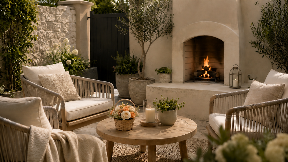
7. European Garden Romance Is Returning in a More Refined Way
The Houzz report shows strong growth around European garden themes: French courtyards up 481%, Italian courtyards up 352%, cottage patios up 204%, and English cottage patios up 131%.
This trend is easy to overdo. The refined version is not only about adding more flowers. It is also about stone, glass, moss, ceramic, soft greens, cream tones, aged textures, and objects that feel collected over time.
In lifestyle retail, European garden romance can support:
Spring and summer displays
Tea table styling
Garden-room themes
Cottage-inspired accessories
Botanical home décor
Glass and ceramic objects
Soft green and cream color stories
The strongest versions feel curated, not overly sweet. They carry a garden mood without becoming too decorative or too holiday-specific.
This direction is especially relevant for botanical décor because it allows flowers, moss, glass, and soft colors to sit within a broader home story.
Where Floral Décor Fits Into These Directions
Floral décor fits these trends because it can translate big interior ideas into smaller, easier-to-place objects. A full room may use arches, stone, warm paint, or garden landscaping; a lifestyle collection can echo the same language through softer shapes, natural textures, muted colors, glass, moss, paper, fabric, and compact decorative forms.
Its strength is flexibility. Floral décor can add warmth without changing the whole setting, and it can bring a seasonal feeling without becoming too tied to one holiday. A small glass-covered botanical piece can suggest soft geometry. Moss or preserved hydrangea can add tactile texture. Cream, sage, taupe, rust, or mushroom tones can make floral accents feel closer to home décor than traditional occasion gifts.
For Sweetie-Gifts, this is where trend translation becomes useful. The goal is not simply to add flowers to a product, but to decide what role the piece should play in a collection: a quiet accent, a natural texture, a compact tabletop object, or a garden-inspired detail that feels easy to place in the home.
For collection discussions or sample development ideas, contact sales@sweetie-group.com.
Final Thoughts
The most useful home décor trends are often the quiet ones. Softer shapes, warmer colors, natural textures, compact scale, calmer styling, and thoughtful packaging can all influence how lifestyle retail collections feel in 2026.
These trends do not need to be copied literally. They can be translated into smaller objects that feel natural on a shelf, a table, a counter, or a seasonal display.
That is where floral décor still has room to evolve, not only as a gift, but as a softer part of the home.

CEO of Sweetie Group


Comments