

The World’s Favorite Colors Revealed — and What They Mean for Gift Designers
- Annie Zhang

- Oct 29, 2025
- 4 min read
If you’ve ever stared at a color palette trying to decide which hue will resonate with your customers, you’re not alone. For many brand and product designers, color isn’t just decoration—it’s persuasion. It influences emotions, drives purchasing decisions, and can turn an ordinary gift into something unforgettable. Yet as consumer preferences evolve, how can designers keep up with what colors truly connect with people today?
Recently, Crayola’s global survey across 183 countries revealed something fascinating: the world is in love with blue. The top three most beloved shades—Cerulean, Robin’s Egg Blue, and Wisteria—show that consumers are gravitating toward calming, balanced, and emotionally grounded colors.
These insights don’t just belong to the art world. They’re critical for anyone designing packaging, floral gifts, or branded collections in 2025.
Index:
What the Global Color Survey Really Tells Us
Crayola’s “World’s Favorite Colors” study was more than a marketing campaign; it was a snapshot of modern emotion. Researchers found a consistent global preference for cool, serene tones over bold and fiery ones. This isn’t a coincidence—it’s a reflection of how consumers want to feel.
After years of global uncertainty, consumers are seeking colors that offer peace, trust, and a touch of optimism. Blues and lavenders, with their connection to nature—the sky, water, and calm evenings—bring a sense of renewal.
Color | Psychological Association | Design Insight for 2025 |
Cerulean Blue | Serenity, reliability, balance | Perfect for luxury floral packaging and calm, minimalist aesthetics. |
Robin’s Egg Blue | Optimism, freshness, creativity | Works beautifully in seasonal collections and spring gift designs. |
Wisteria (Lavender Purple) | Elegance, imagination, romantic calm | Ideal for feminine or premium product lines targeting high-end clients. |
These colors don’t just appeal to the eye—they evoke trust and sophistication, something every gift designer aims to achieve.
If your product line still leans heavily on bright reds or deep golds, it may be time to refresh. You don’t need to abandon passion and energy, but blending them with these trending cool hues can instantly modernize your look.
Looking to update your color palette or packaging collection for 2025? Contact our design team at sales@sweetie-group.com to request trend-based samples.
How These Colors Are Changing Gift and Floral Design
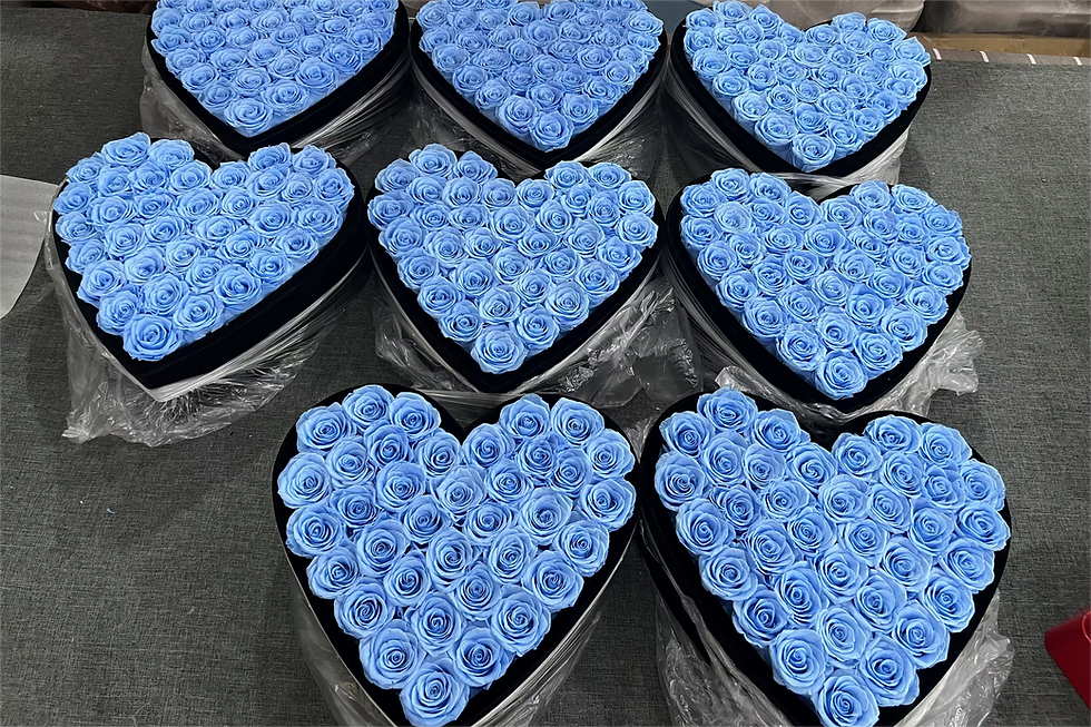
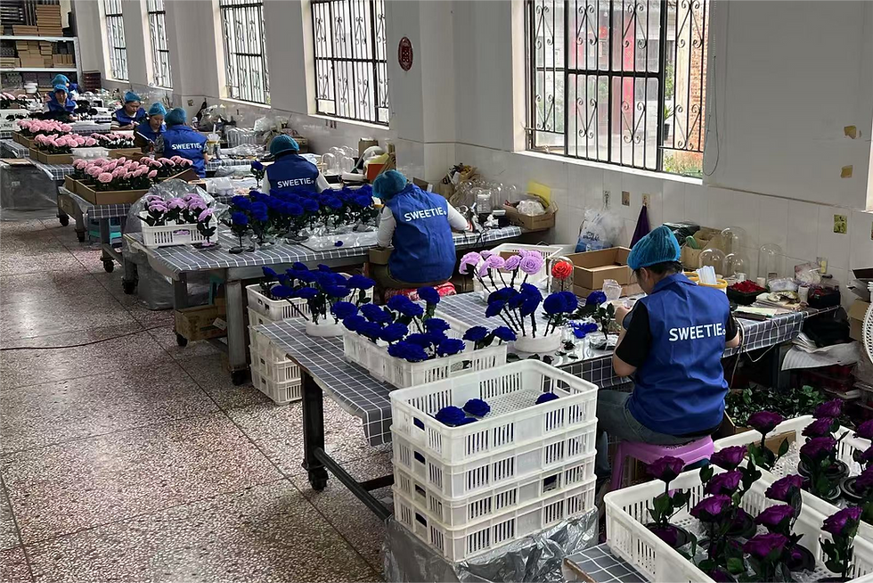
At Sweetie-Group, we’ve noticed a shift among our European and American B2B clients: they’re asking for softer, calmer palettes that still feel premium. Gone are the days when Valentine’s Day demanded only bright red roses. Now, many brands are embracing blue and lavender roses to symbolize sincerity, trust, and timeless love.
For floral designers, this shift opens new creative possibilities:
Blue preserved roses paired with gray or white packaging evoke modern minimalism.
Lavender flower boxes convey poetic elegance—perfect for Mother’s Day or luxury retail collaborations.
Blue-green tones in preserved hydrangeas and eucalyptus reflect sustainability and freshness.
When combined with metallic accents—such as champagne gold ribbons or matte silver boxes—these colors create a balance between tranquility and high-end appeal.
If you’re developing a new floral gift line for next season, consider testing these palettes with small-batch orders. Sweetie-Gifts offers custom OEM/ODM services with low MOQs, allowing you to experiment safely before scaling up. Email us at sales@sweetie-group.com to discuss customization and prototyping options.
Why Blue Dominates in 2025—and What It Says About Your Customers
According to color psychology experts, blue’s global popularity isn’t just aesthetic—it’s ecological and emotional. Blue reminds people of clear skies and clean water, both associated with safety and renewal. In uncertain times, that’s comforting.
Moreover, blue transcends gender and cultural boundaries. It feels modern in Scandinavia, trustworthy in the U.S., and elegant in Japan. It’s one of the few colors that can speak universally to calmness and quality.
For gift designers, this means that integrating shades of blue or lavender into your brand story isn’t a trend—it’s a strategy. Whether it’s a preserved rose in a transparent acrylic box or a luxury jewelry-flower set, these colors signal refinement and reliability, values today’s consumers are willing to pay for.
Need help translating these insights into your next packaging concept or color story? Reach out to sales@sweetie-group.com for design consultation.
Bringing It All Together
The 2025 global color trend confirms something profound: people are craving peace, balance, and connection—and they want their gifts to reflect that feeling.
For floral and gift designers, embracing Cerulean, Robin’s Egg Blue, and Wisteria isn’t about chasing fashion; it’s about creating emotional harmony between product and recipient. When your design language mirrors what the world finds beautiful and reassuring, your gifts don’t just sell—they speak.
If you’re developing your 2025 collection and want to align with these global color trends, our team at Sweetie-Group can help you bring calm luxury to life through preserved flowers, elegant packaging, and thoughtful design.
Contact us at sales@sweetie-group.com to start designing your next trend-ready gift collection.
Warm Regards,
Sweetie-Group | Etrnal Flower & Creative Gift Manufacturer

Comments