

Color Psychology in Seasonal Retail Displays: How Different Shades Drive Shopper Behavior
- Annie Zhang

- Aug 27, 2025
- 4 min read

Imagine a shopper strolling past your store. They won’t stop because of the SKU number, or even the product itself, but because something visually pulled them in. Research shows that color influences up to 85% of consumer purchase decisions (Harvard Business Review).
For retail buyers and visual merchandisers, this means one thing: the color palette of your seasonal displays can be just as critical as the products inside. A poorly chosen scheme might leave customers walking by. The right colors, on the other hand, can inspire curiosity, emotion, and even impulse purchases.
In this article, I’ll walk you through how different shades work with shopper psychology across spring, summer, fall, and the holiday season. By the end, you’ll have a practical framework for planning retail displays that don’t just look good but actually convert traffic into sales.
Index:
The Science of Color Psychology in Retail
Color isn’t decoration. It’s a subconscious influencer. Studies show that color increases brand recognition by up to 80% (University of Loyola, Maryland). Different shades trigger distinct emotions and actions:
Color | Shopper Perception | Retail Application |
Red | Urgency, passion, appetite | Promotions, clearance events |
Blue | Trust, calm, reliability | Banks, tech, premium retail |
Green | Nature, eco-friendliness | Sustainable products, organic sections |
Yellow | Optimism, energy, warmth | Entry points, summer campaigns |
The key takeaway for retail buyers: you’re not just buying inventory, you’re buying a color-driven shopper experience.

Spring: Fresh Starts with Pastels and Renewal Shades
Colors: light green, lavender, blush pink.
Spring is the season of new beginnings. Consumers are psychologically primed for freshness and optimism. Retailers who use soft, airy tones in their displays tap into that emotional reset.
In European department stores during Easter, pastels dominate window displays. A combination of light green and lavender often signals renewal and growth. The effect is subtle yet effective: customers perceive stores with these palettes as welcoming and up-to-date.
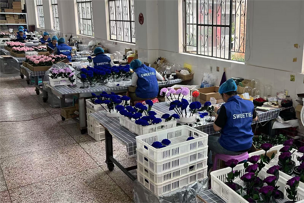
Preserved flowers can play a role here, too. Unlike cut flowers that wilt in days, preserved pastels maintain their vibrancy for months, keeping window visuals consistent throughout an entire season.
If you’re planning your spring campaign and want to explore long-lasting floral display options, feel free to reach out to us at sales@sweetie-group.com.
Summer: Bold Contrasts That Spark Energy
Colors: bright yellow, turquoise, coral red.
Summer retail is all about high energy and outdoor freedom. Bright hues stimulate excitement and urgency. For example, American malls often use yellow and aqua blue to evoke sunshine and water, perfect for driving vacation-related purchases.
However, bold colors must be balanced. Too much intensity overwhelms the eye and can cause visual fatigue. Many retailers use bold accents—like a coral centerpiece or turquoise trim—against neutral backdrops for maximum effect.
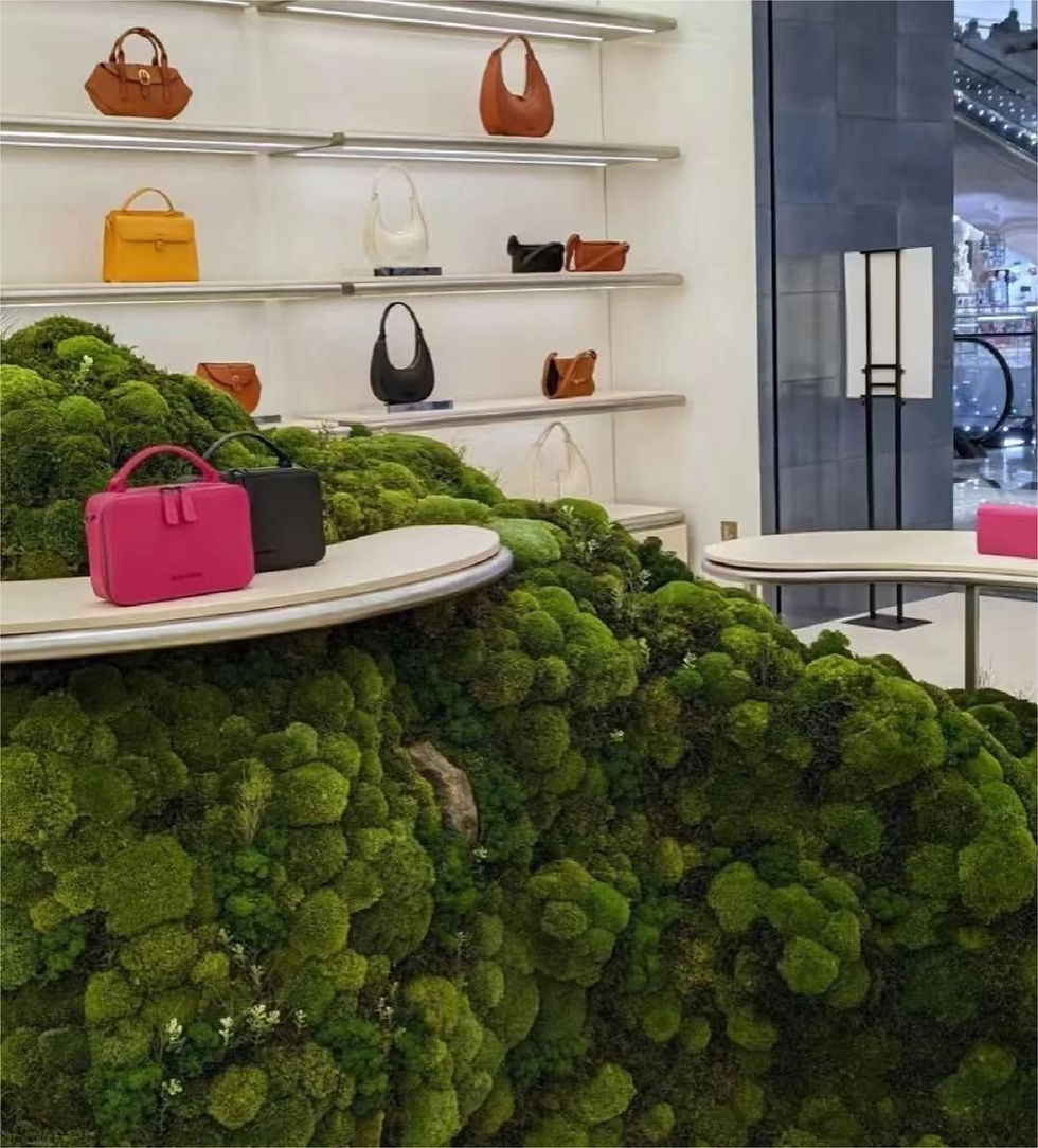
Preserved moss in vivid summer tones allow for these accents without the constant replacement costs of fresh décor.
Fall: Warm Tones That Encourage Nostalgia
Colors: burnt orange, burgundy, mustard yellow.
Autumn carries themes of harvest, gratitude, and nostalgia. Customers are more receptive to earthy palettes that feel cozy and safe. In the U.S., Thanksgiving promotions heavily rely on deep orange and burgundy tones. These colors remind shoppers of family gatherings and seasonal rituals, subtly encouraging them to stock up early.
Retail buyers should avoid cool tones in fall displays, which can disrupt the sense of warmth. Instead, layering multiple earthy shades creates depth and comfort.
Here again, preserved arrangements in rustic palettes help maintain consistency through the entire season without losing vibrancy.
Winter & Holiday Season: Luxury Through Contrast
Colors: red and gold, white and silver, dark green.
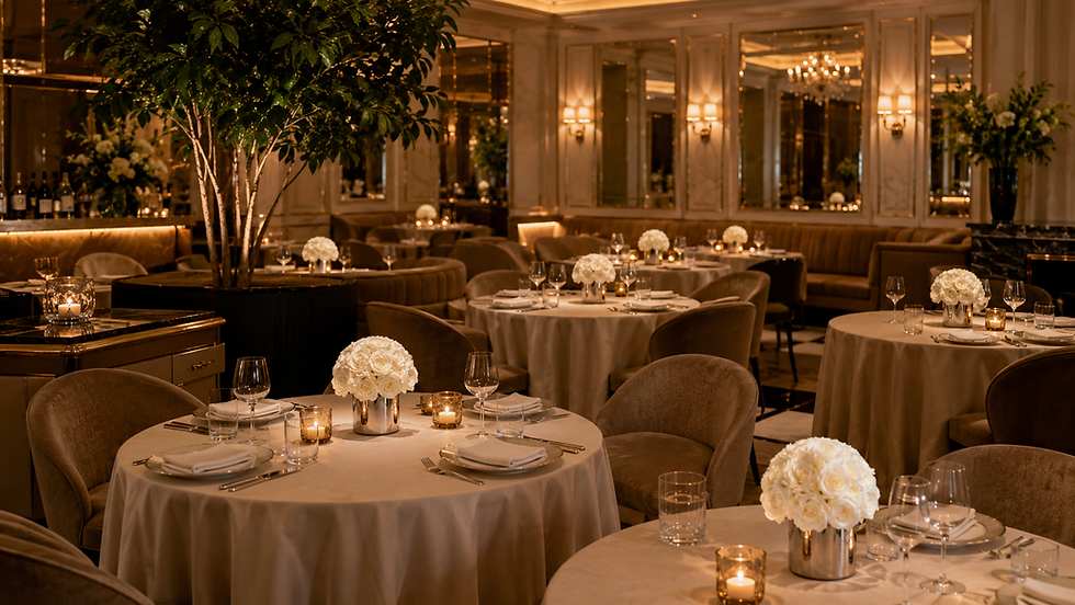
The holiday season is the high-stakes moment for retailers. Consumers expect displays that feel festive, magical, and aspirational. Red paired with gold is a global classic—it conveys abundance and celebration. In contrast, white and silver dominate Scandinavian displays, projecting purity and minimal elegance.
High-end retailers like Harrods in London have long leveraged these combinations to elevate their brand image during December. Shoppers link these palettes with premium value, making them more willing to spend on gifts.
For chain stores or supermarkets, preserved floral domes in red-and-gold or green-and-silver not only align with holiday palettes but also survive through the entire holiday shopping rush.
Curious how seasonal color psychology can be applied in practical store displays? Our team can share references from European and U.S. retail markets. Just drop us a line at sales@sweetie-group.com.

Practical Tips for Retail Buyers and Merchandisers
Maintain consistency: Ensure store interiors match window displays for a seamless shopper journey.
Plan updates quarterly: Stores that refresh displays seasonally see 22% higher return visits (Shop! Association).
Segment your audience: Younger shoppers often react to bold contrasts, while older demographics prefer understated palettes.
Test regionally: Color preferences vary—Southern Europe favors vibrant tones, while Northern Europe leans toward minimalist schemes.
Conclusion: Color as the Silent Salesperson
Color is more than decoration. It’s the silent salesperson that attracts, persuades, and retains shoppers. From spring pastels to holiday contrasts, aligning displays with seasonal color psychology can maximize ROI without changing a single SKU.
For retail buyers and procurement managers, the key isn’t just stocking shelves. It’s curating an emotional experience that begins at the window. Preserved flowers, with their ability to hold rich hues for months, are just one tool in a larger visual merchandising strategy.
About Sweetie
At Sweetie-Group, we’ve spent over 16 years helping global retailers, supermarkets, and premium brands design floral gifts and decorative solutions that align with seasonal display strategies. Our clients include chain stores in Europe, the U.S., and Asia, along with luxury partners like Dior and Lancôme.
If you’re exploring how to bring seasonal psychology into your visual merchandising plan, we’d love to discuss insights or share market references. You can always reach us at sales@sweetie-group.com.
Warm Regards,
CEO of Sweetie-Group


Comments